4.5.12

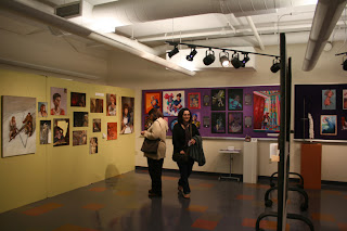
So commencement is this week at Kendall College of Art and Design and that means it's time for the annual Student Exhibition! I had a place up on the seventh floor alongside some really fabulous artists. It's only up for one more day so if you haven't had a chance to see it yet: GO!

I took a couple shots of my work:


And a few shots of the work I got to share a room with!


28.4.12

Man's Life

Our final assignment in Advanced Print Media was to design a magazine cover. It took me a while to figure out what magazine I could design for but when it came to me I knew there was really only one choice all along:


I knew it would be a challenge to come up with titles as good as "Weasel's ripped my flesh!".


I settled on a young sailor fighting the Kraken. Originally he had a knife in one hand, but I decided that it would be much more manly if he just punched the Kraken to death. Here's the original sketch:


I created this cover in a mix of colored pencil blended with turpenoid, acryllic washes and some gouache touchups at the end for highlights and bubbles.


 While I had fun making the cover, I'm not sure if this approach is really for me. I think I prefer painting.

Glitter Talk

More glitterbones! This time I used some holographic paper from JoAnn's instead of glitter and I really love the effect. It doesn't completely translate digitally, but it's real fun in person!

And some thumbnails.. everyone loves thumbnails.

19.4.12

Black Death!

So one of my projects for Advanced Print Media was to create an image for any article we wanted in any magazine. My favorite subjects are scientific, especially stuff involving disease. I ended up finding an article online concerning the Black Death and how its genome has changed very little since it swept across the world. 

I instantly knew I wanted to do something with the plague doctors, I mean what is a cooler image than that?


After working through some of the composition, the gouache was added!

Hand painting some text on acetate and working out some kinks after a critique....


 And voila! Added some of the article and did a bit of digital finagling to get everything lookin nice!
 The article I created my faux layout for can be found here: Spawn of Medieval Black Death Bug Still Roam the Earth. Give it a read!


14.4.12

Glitter Bones!

Just wanted to give you guys a quick peek at some of my newest work, Glitter Bones! I have a love of anatomy and glitter... I guess this is what happens when those two combine. I'm hoping to have at least 2 more of these finished for the Open House at Kendall on May 1st. Make sure to stop by!

Snow Queen.... Glitter Queen

I recently entered Greenville's Danish Festival Poster contest. This year's theme was the Hans Christian Anderson tale 'The Snow Queen'. I thought it could be fun so I thought I would give it a shot. First, the thumbnails!


I decided on this composition after a bit of fiddling and realizing that I could use glitter for the icy wind! I ended up aging the children a little because I can't seem to draw kids very well. They usually end up looking like some sort of nightmare creatures (I know some people might say that that is what they ARE, but I think they're alright haha)
My poster didn't end up winning but it was fun to try anyway. It was also enlightening to see just how fast I could get a piece done in between grad school visits, work and other school projects. My favorite part of this project was getting to apply the glitter! It stuck to me for a long, long time. I'm still finding flecks of it about my person.

It also inspired the next project I worked on, Glitter Bones!

The Knife - Silent Shout


One of the first pieces I'd like to post is an assignment I did for the Advanc

ed Print Media course I'm currently enrolled in here at Kendall! We had to design a folded insert for an album of our choosing. First came the thumbnails:


As you can see, I had pretty much no idea what direction I wanted to go in. I ended up trying to refine one of the figures on the first page, added some friends in and with a little Photoshop magic ended up with:

One of the challenges of this piece was to not only create a working composition across the entire page, but also make sure that it was successful split in half too. The piece is folded in the center and the left side ends up on the front of the jewel case while the left in what you see when it's opened.

I ended up experimenting a bit with my medium and trying out some gouache since it dries so fast.
After I finished the painting, I hand rendered the major text in acrylic on an acetate sheet placed over the painting to protect it. Another part of this class was hand rendering our major text in order to practice precision. It was a huge pain in the butt... but ended up looking pretty nice in person!


Helllooooooo again!

Hey everyone (no one), it's been almost two years since I updated this blog. Sorry about that. But! Things are about to change. I've got a lot of new work to post, did a few shows, there's a new direction for my work and I'll be heading off to graduate school to study some medical illustration! Apparently, a lot can happen in two years. I'll also be re-designing the blog and doing some general housekeeping around here too so stick around!